My Space: Libby Callaway's Living Room
All photos by Caroline Allison
From the start, I’ve known that the The Callaway Report would expand its coverage of the lives and work of creative people to include their homes. I love talking to my interior design-savvy friends about the inspiration behind their favorite rooms and hearing the backstories of the possessions that they love the most. In the process of telling me about their spaces and the things that fill them, my friends inevitably reveal something new about themselves.
Those revelations are the heart of My Space, a new occasional feature on TCR wherein I’ll talk to Nashvillians with unique home styles about their favorite room. Each post will feature great photography by Caroline Allison, who has made shooting noteworthy interiors her forte.
I’m kicking off the series with my own living room, for two reasons. One, it was super-convenient (obviously). And two, because it’s awesome – a 12-by-15-foot kaleidoscope of color, texture and shine. And stuff. Lots of stuff.
Let me back up and say first that I’m a big fan of minimalism. Some of my favorite rooms are spare spaces with pale paint jobs, decorated with pots of succulents and vintage Danish furniture.
I love that look. I might even envy it a little: From time to time I definitely wonder if my life might be easier - calmer, saner, more productive – if I lived in a house with plain white walls instead of one where the bathroom is wallpapered in shiny silver Mylar printed with a hot pink kiss motif. Ultimately, though, I am just a tourist in the Kinfolk world. The minimalist life is not for me.
I am a maximalist.
All too often, when it comes to my home, the old saw about too much being just enough is spot-on. OTT is A-OK chez moi.
I like color, prints and patterns – lots of them, together. I gravitate toward reflective surfaces; I dig things that glitter. I like creating unexpected visual mash-ups that marry opposites: high and low, cheap finds and bank-busters, Mid-Century Modern and Hollywood Regency, the pristine and the fucked-up.
I decorate my house the same way I curate my closet. I don’t worry about era or style, and I don’t pay much attention to provenance or, to be totally honest, making sure it’s of the very highest quality: if a piece makes me happy, I’ll fit it into my world.
My living room is the perfect example of the more-is-more ethos. With a wall full of “lady paintings” (more on those gals later), tables and shelves stacked with books and mementos, and a bright blue and pink antique Oriental rug underneath to tie it all together, it’s a unique mishmash of the things I love that somehow manages to be both elegant and comfortable. It’s easily my favorite room in my house. (It’s actually been photographed for publication several times, most notably by my friend Todd Selby, who flattered me back in 2013 by featuring my home on his blog, The Selby.)
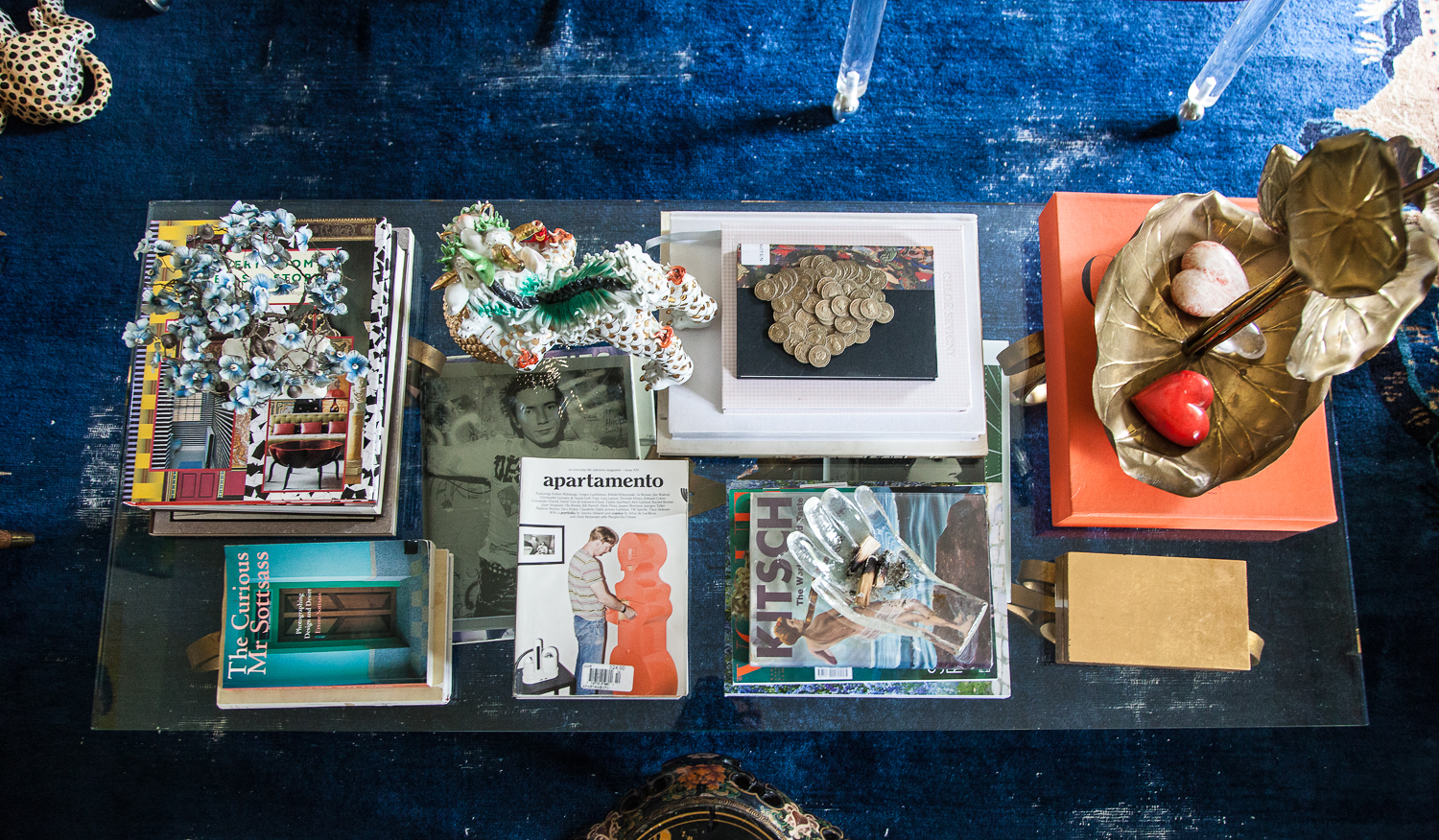
At first glance, the room might look cluttered, but nothing is extraneous. Everything has a place and a reason for being there, which is usually personal.
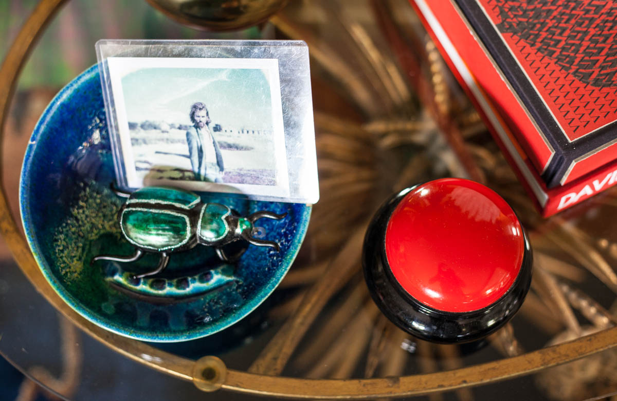
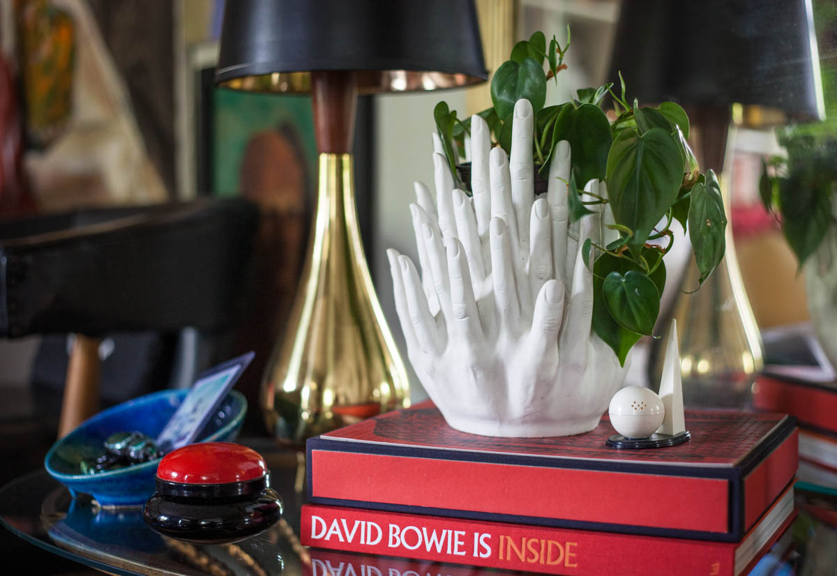
Few things in the room were very expensive; most of the value here is intrinsic. I mean, how can you put a price on the polo ball my grandfather hit while playing on a farm team back in the 1930s in a bowl near the door? Or the sentiment behind the mini salt and pepper shaker shaped like the famous Trylon and Perisphere buildings from the 1939 World’s Fair in Queens that my friend Janet gave me to mark my move from New York to Nashville? Or, for that matter, the epaulettes that cap the arms of the couch, which I found in a junk shop on Belmont Avenue that have since graced some very cool photo shoots?
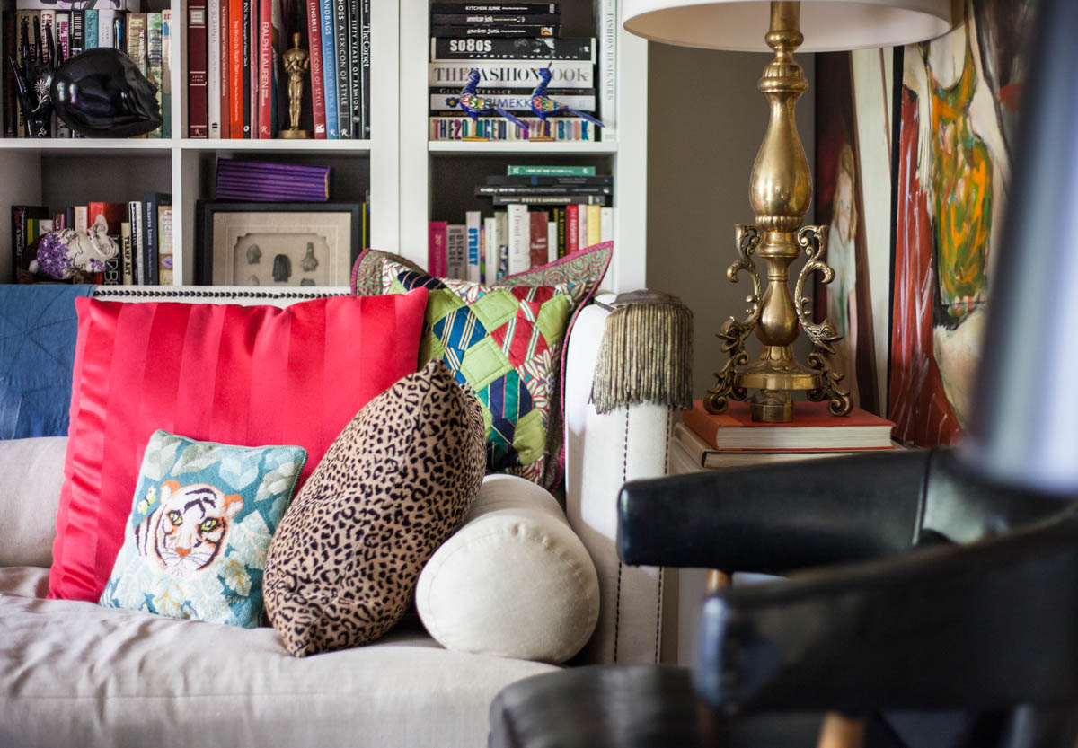
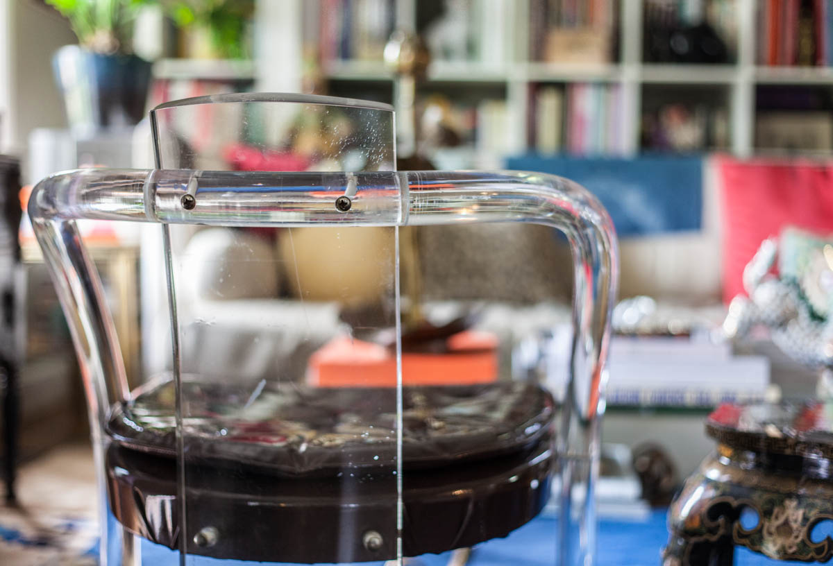
Most of what I own is secondhand, either purchased by me at a flea market or antique store, or a hand-me-down from my family. A lot of things aren’t in perfect shape. Take the Lucite chairs, a double-score from Gas Lamp Antique Mall, which are long overdue for a date with the upholstery guy. And the couch – a very heavy slab of feather-topped awesomeness that’s long and deep enough for two not-small adults to stretch out on together comfortably (I tested this). It has a pink water stain on the front right bottom corner – something no one ever seems to notice and that I'm happy to live with, considering I got it at an auction for $125 (original retail price tags still attached: $11K).
Behind it is a bank of white Ikea Kallax bookcases. They’re cheap, but look great. Not only that, but their design creates perfect little squares in which I can create vignettes using pieces from my collections and books, which are among my favorite decorating props. This case mainly has fashion, art and design reference books that I admittedly use at least as much for their look as I do their contents. I go in phases of organizing them by color or topic, but after a while they just get jumbled up again. The Dewey Decimal System is not spoken here.
Among the books are a bunch of random objects: a mink-trimmed monkey in polyester tails from the Nashville flea; a few pieces of vintage doll furniture; a family of Steiff hedgehogs I found at an antique market in Berlin; a satin Anya Hindmarch clutch featuring a photorealistic eye.
Also on the shelves: the remnants of the cast I wore back in 2003 when I broke my wrist in what I like to call The Manolo Incident. It happened during the days before I went into physical therapy for chronic lower back pain, when traipsing around NYC in four-inch stilettos seemed like cake - that is, until you drink too much champagne at your birthday brunch and slip on a wet subway platform. The only person I allowed to sign my cast was my friend Marisa Acocella Marchetto, a well-known cartoonist, who drew a woman with a raised eyebrow over the quote, “I’ve heard of killer shoes but this is ridiculous.” (Great side story: since this was back in my fancy fashion editor days, the Manolo Blahnik team ending up catching wind of the accident and sent me a huge bouquet of roses and a very sweet, albeit unnecessary, note of apology.)
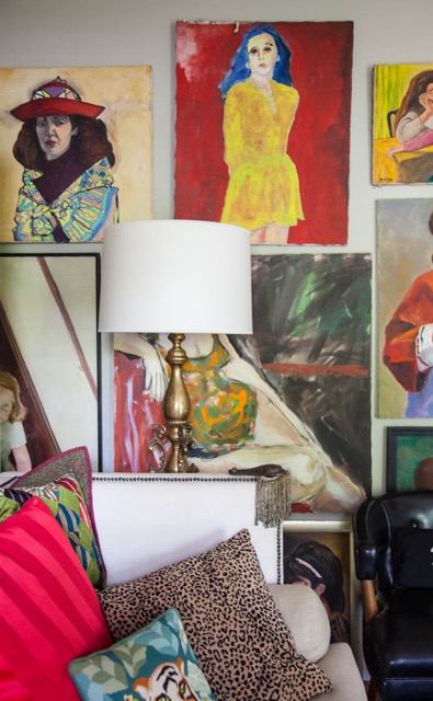
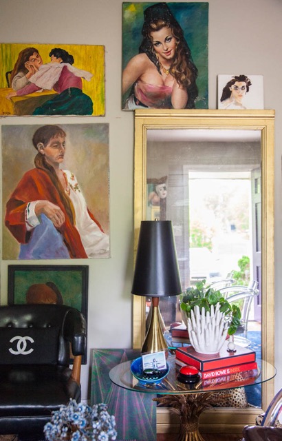
Above the bookshelves and throughout the room are selections from my collection of lady paintings, which I’ve been buying from thrift stores, flea markets and estate sales off and on for almost 25 years. I started the collection with a quartet of women by the same amateur artist (none of these portraits are what you might call “good” art; that’s beside the point); they cost 98 cents each at a thrift in Knoxville. After that find, seeking out paintings I loved that met my self-imposed budget became a sport that I played for many years. My cap is usually set at $20, but I’ve been known to splurge if someone has an especially good look. I have over 80 lady paintings now, and none of them cost more than $40.
Some of my favorites include a blue-haired girl in a yellow dress painted on a red background; what I assume is a Modigliani-inspired portrait of Angelica Huston; a little girl sitting on a staircase with a glint in her eyes that makes her look like a stand-in for the young star of the The Bad Seed; and a horizontal composition of two women facing one another over a table, engaged in... arm wrestling? A make-out session? No one has been able to crack the mystery so far. And I like it that way.
The ladies are a constant topic of conversation. I’ll sometimes ask visitors to pick their favorite lady. Invariably, whether it’s a man or a woman doing the picking, they choose the chesty seniorita wearing a black mantilla and a come-hither smile. She’s extremely sexy and almost out of place among the other basically prim women on display. Her gaze has power.
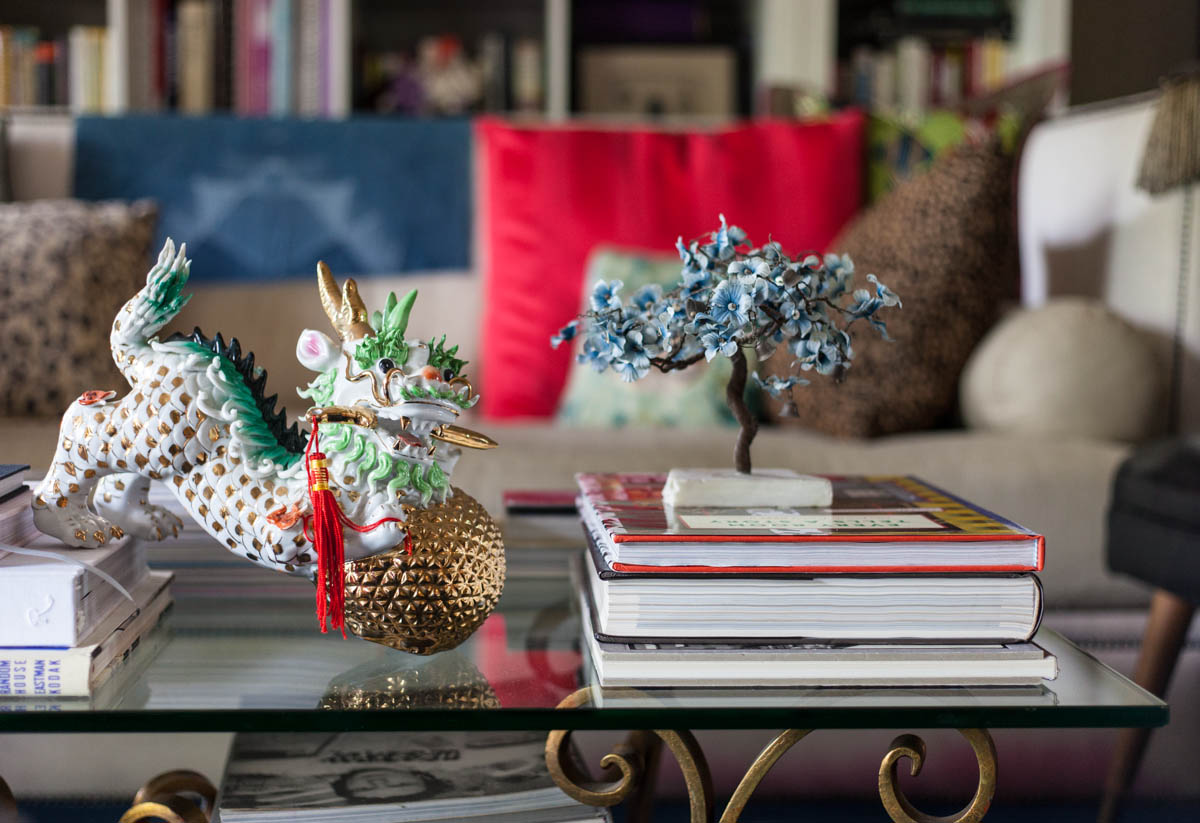
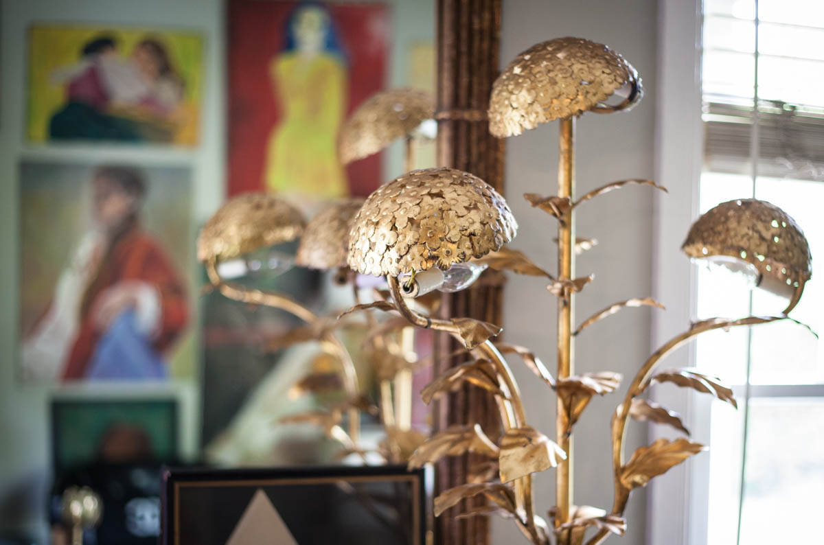
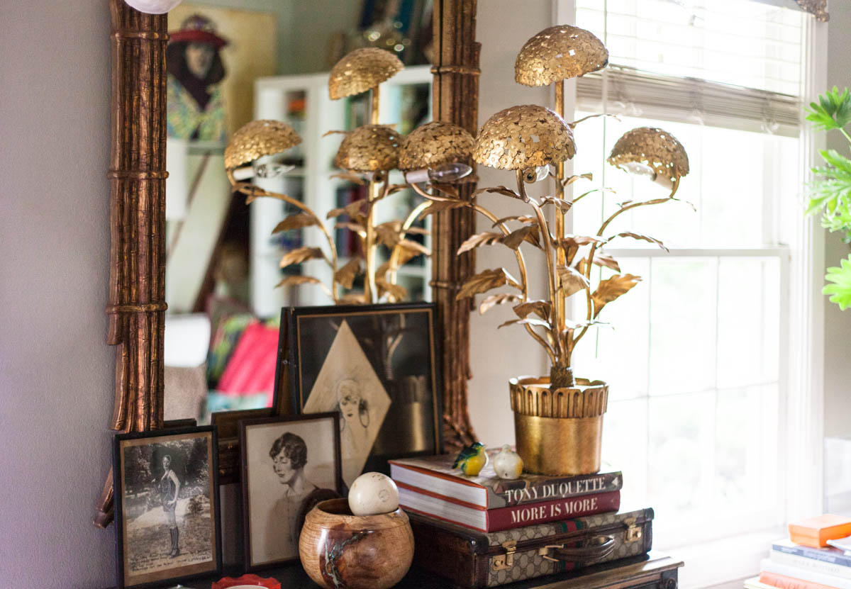
The ladies are hung in a casual formation that’s bracketed on the right side by a very heavy leaded glass mirror excavated from a now-gone ‘30s-era Woolworth’s in Cleveland, Tennessee, my hometown. I rescued it from my parents’ garage a few years ago and painted it gold, as I am wont to do when faced with bare wood. Mirrors and metallics are recurring themes in my décor, much like Chinoiserie, dragons, hearts, little birds and “big cats” (the ceramic mother and baby leopard in my living room both wear heart-shaped lockets; it’s kind of adorable). I also have my share of tole – the ornate gilded metalwork favored by fans of the Regency style. There are several examples of it in the living room, the most dynamic being a lamp shaped like hydrangea blooming from a pot. I’ve never seen another like it.
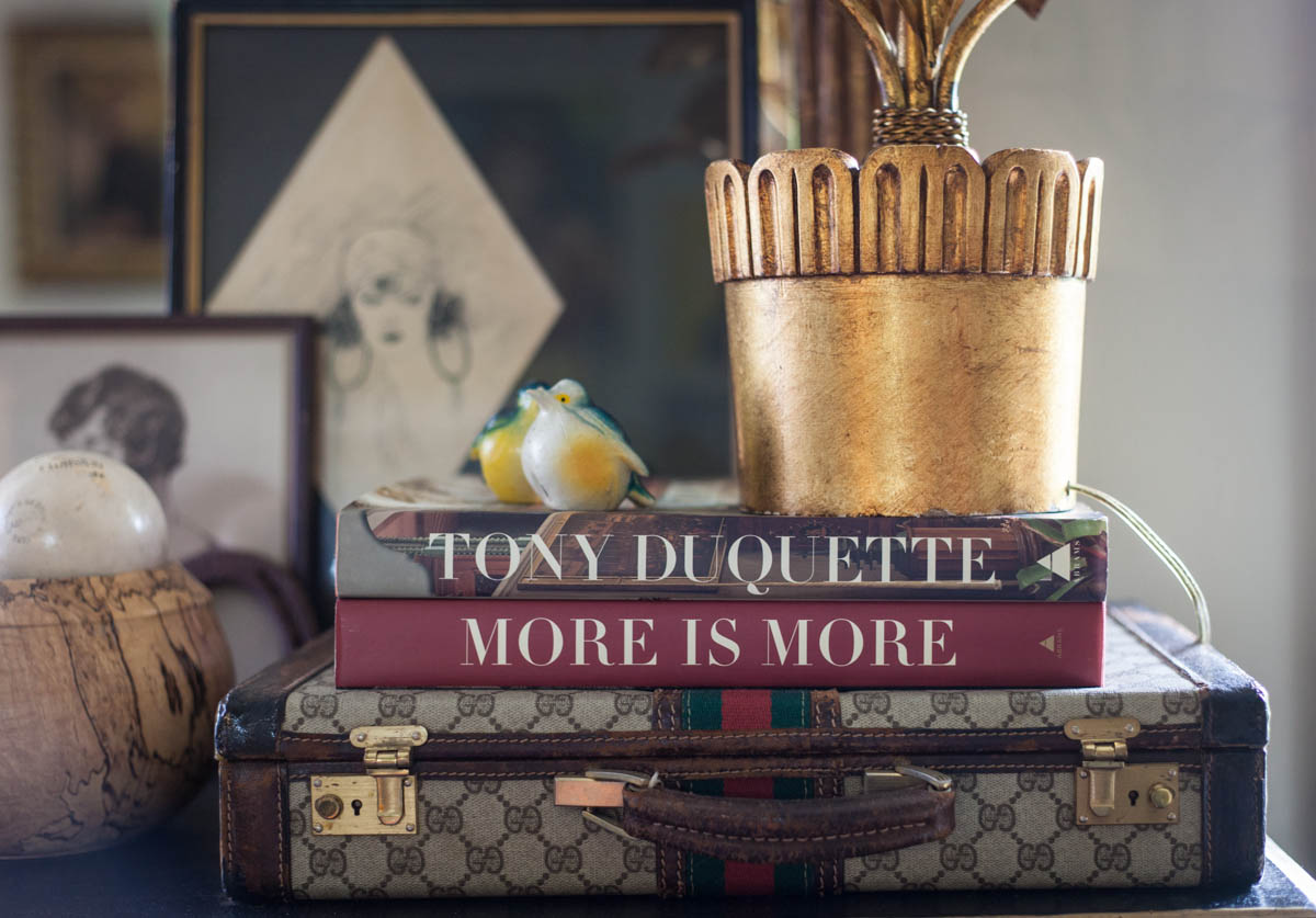
The lamp stands on a stack of objects with a Gucci logo briefcase for a base. I picked it up years ago at the best thrift store in the world, The Gold Mine in Sun Valley, Idaho. On top of the Gucci are two books about the Tony Duquette, the famed artist and designer of mid-century Hollywood interiors and exteriors, film and stage sets, costumes, jewelry and just about anything else he could get his hands on. Wildly creative and prolific, Tony is the OG of modern OTT design.
These books are major design touchstones for me, a framework for what can be possible in a space if you open your mind and don’t discriminate when it comes to materials. After all, this is a man who applied crushed abalone shells to ceilings and walls to make them sparkle and who used the jet-beaded fabric from a Victorian-era ball gown to recover a side chair.
Tony literally made treasures from trash. In an exercise he called “Games of Chance,” he challenged himself to create beautiful objects out of random things he found. One such project photographed for his namesake book is a mandala made from shells, a plastic wastepaper basket, and the shredded bottoms and thong from a pair of rubber sandals. It’s beautiful.
Obviously, I'm a huge Tony fan-girl. I could go on and on. But truly, I'm barely doing him justice. Do yourself a favor and give him a Google. And then get ready to go down a fabulous Duquette rabbit hole.
Speaking of animals… A few years ago, I visited a spiritual healer who told me that my spirit animal is an eagle. I think he was wrong.
My spirit animal is Tony Duquette.
Our friend Caroline Allison is as talented as she is kind – and damn if she isn’t one of the nicest folks we know. Lina’s photography has been shown extensively in the U.S. and abroad; this fall, an exhibit of her new work will open at Zeitgeist, the Nashville gallery where she has representation. A contributing photographer for Garden & Gun, Lina also shoots for Lonny, Southern Living and, ahem, The Callaway Report.

